Find the nearest account line on equity charts
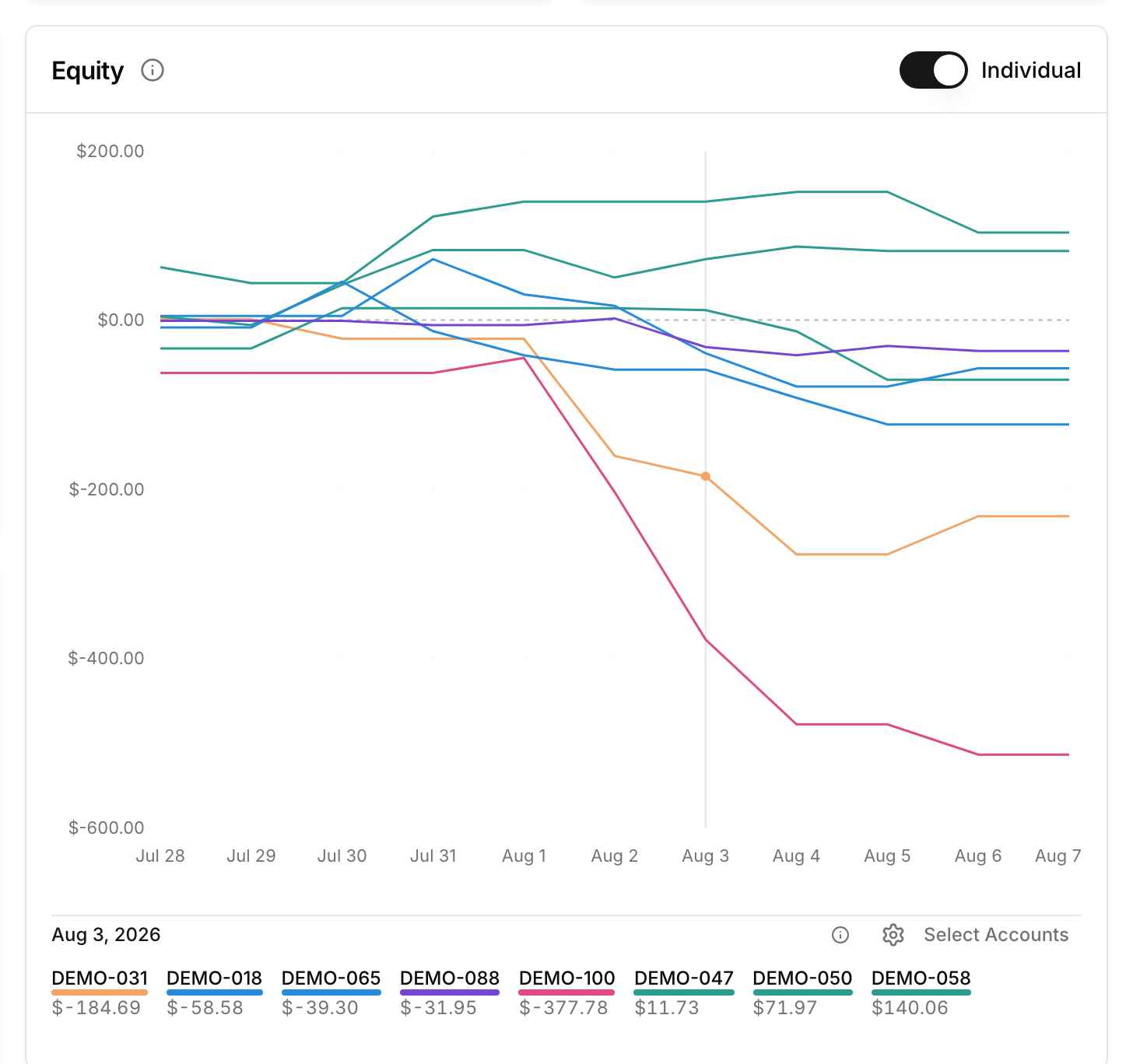
Overlapping account lines are easier to tell apart in the dashboard equity widget. In individual-account mode, move the pointer near a line to give that account the active dot and move it to the top of the legend. Other accounts with equity at the same date follow in order of their distance from the pointer. Away from the chart, the legend returns to its latest-equity ordering.
Choose the accounts you want to compare
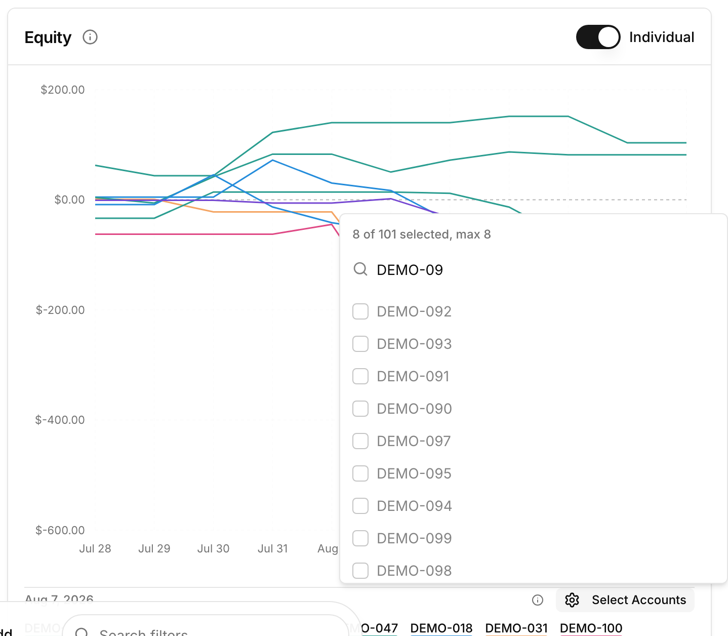
Select Accounts is now searchable on desktop and opens as a drawer on mobile. The selector shows how many accounts are selected and caps the chart at eight—the number of distinct series colors available—rather than silently accepting lines it cannot draw.
The full proximity legend is designed for the main individual-account chart; shared, team, and compact widget views keep their simpler presentation. Open the dashboard and move between several account lines to try it.